To customize this shuffle game for your own team, please connect with us today!
Fun race game video produced for the Hadlock 500 race.
Great inaugural season working with the University of New Hampshire and their brand new football stadium.
For 2016 we worked with the Chicago White Sox to develop dozens of animations for their array of video screens. Here is a small sample from their main video screen promotions.
Bank of America needed an animation to support their sponsorship at the Charlotte Motor Speedway. Yet, they could not infringe on any NASCAR copyrights, so all vehicles had to be clean of any identifying marks. The entire animation was created in 24 hours.
Simple 3D looping logo for St. Francis University.
Worked with the Pittsburgh Penguins at the beginning of the season to compliment their open sequence. We also built complimentary ribbon boards throughout the venue. They have a lot of boards at the Consol Energy Center!
Arenamation worked this year with the New Orleans Saints to build their 2012 Intro video. This video is played right before the players leave the tunnel and represents a small slice of the 3D scenes and character animations built to support other efforts for the team.
Arenamation worked with the Ottawa Senators to create a 3D logo of their "Believe It" logo. The logo is to be used as a screensaver on their jumbotron during home NHL playoff games.
Please check out our new Arenamation company overview video.
Thanks to Brian McCauley for featuring Arenamation on his popular Graphics Mafia web site "A Place for Those Who Create Sports Graphics".
Sample of a 3D logo using the Boston Celtics primary mark.
New hat shuffle game for the Oakland A's.
Sample "It's Good!" field goal animation for football.
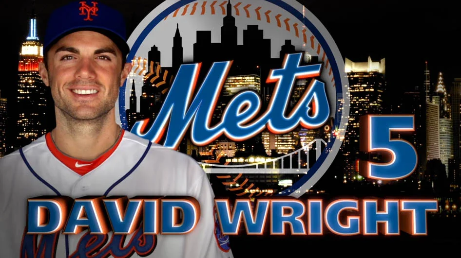
Sample headshot for New York Mets 3rd baseman David Wright. Designed by Jay Flaster for Arenamation.
New "Make Some Noise" game prompt branded for the LA Lakers.
Some work in progress for Ticketmaster's NHL activations in 2012.
Arenamation continues to work with Ticketmaster on building content for their 2012 NBA sponsorship. This piece represents a concept which will eventually evolve into an HD video to be played at NBA games across the country.
Most designers are used to working in a typical 16:9 aspect ratio, the same screen size as your typical HD television. So what does it look like to work in the aspect ratio of your typical LED ribbon board. (click here for a sample image) This sample image has an aspect ratio of 875:2! This sample image has an aspect ratio of 875:2! Some of the newer venues in sports have tremendous dimensions for their ribbon board LED signs. For example, Yankee Stadium’s LED ribbon board is over 14,000 pixels wide and only 32 pixels tall. Compare that to your 1920 x 1080 HD television at home. Big difference, no?


